Excel
Excel table is the basic output of Marketing Miner that is available to a user after completing a report. It always contains an initial list (Report) that summarizes info about collected data, then a general list Data that contains data that were accessible at output for individual lines, and then other lists according to miners that cannot be paired straight into a line.
Design adjustment
After downloading and opening the file, a user gets to the initial list (Report). Some Excel versions ask for permission before manipulating, because it is a file that is downloaded from the internet, comparably to the image below:

To be able to manipulate the file, a user first has to give permission to do so. Excel also often displays output file without wrapping the text, which could look chaotic to a user. To make it more clear for a user, the wrap text function should be removed:

Filter creation
Filter function is used to adjust data display. This function will create a filter range from the top columns, which will allow user to search for rows in columns or to otherwise filter dataset content:
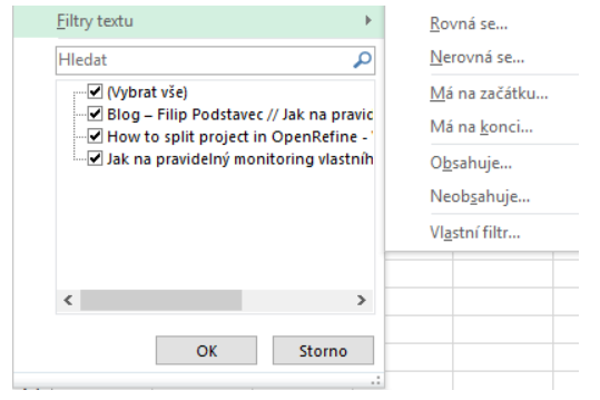
Examples of content filtering
Basic filtering is text filtering. A user types in a part of the text that corresponds with the cells of selected column and after clicking OK, a user gets to the dataset only corresponding with the assignment.
Excel has two basic and most commonly used types of filters:
Text filters
In case there is a text content in the column cells, Excel uses text filters to filter it. These filters work similarly to searching and their functionality is intuitive to its name.:
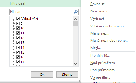
Number filters
In case there is a numeral content in the column cells, Excel uses number filters to filter it. Those allow user to select a part of the dataset that corresponds with more complex conditions of the range or with the minimum or maximum value of the column cells.
Conditional formatting
Conditional formatting is used to change a color of the cell, based on its value compared to the whole column. An example of the application and the output can be found in the video below:
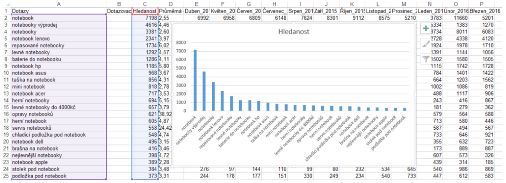
Making charts
Using output data, a user can then make charts:
Other tutorials for Microsoft Excel:
Instructions on how to make charts in Excel can be found at:
http://blog.hubspot.com/marketing/how-to-build-excel-graph#sm.0001r0d1h49fkev4ss01cfocetczs
OpenRefine
For the below mentioned operations, it is necessary to have one of the versions of OpenRefine installed. You can find them at:
http://openrefine.org/
Creating a project from imported data
To import a project into OpenRefine, an XLSX file of downloaded output from Marketing Miner should be imported at input for this tool. In the second step, it is necessary to select the list of sheet that is going to be processed. OpenRefine should automatically detect coding of the file and display a project preview in the output example.
After naming the project and clicking on Create project, a new project will be created in OpenRefine, and you can work with it further, with the help of instructions below.
Facet application and output filtration
One of the strengths of OpenRefine is working with Facets and Filters. They allow user to work quickly with identification of potential problems and opportunities. Facets can be simultaneously combined among themselves. Basic tools for content filtration and segmentation are:
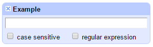
Text Filter
Simple search through the match of part of the text with the cell content. In the text filter, a user can work with regular phrases or they can specify if their assignment is case sensitive (depends on letter case).
Text Facet
Text Facet clusters cells based on their match. It looks into the whole column of a project, which a user clicked on, and combines all the cells with the same content, so a user can filter the content of the same cells in the column.
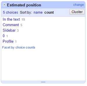
This Facet works similarly to clustering according to the cell content, when filtering in Excel.
Numeric Facet
Numeric Facet takes into account cells of used columns that have numbers in them, and then carries them out to an X axis, where a user can, using shifting the range of the axis, define data that he wants to work with (or data he wants to see).
After carrying out Numeric Facet above more columns, their restrictions are combined.
Scatterplot Facet
Scatterplot Facet works similarly to Numeric Facet, with the difference that it carries out the data to two axis at the same time. A user then gets one metric on X axis and another one on Y axis. After selecting the Scatterplot Facet segment, a user gets to the filtered content that falls into their selection.
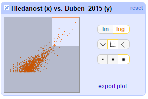
For example, Scatterplot Facet is perfect for Boston matrix.
Word Facet
Word Facet is located in the section Customized Facets and simply takes the cells of selected column and it divides them into words. After that, it calculates the frequency of their occurrence and shows it at output.
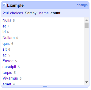
With Word Facet , it is easy to find out the frequency of occurrence of specific phrases or when checking your content or copying from competition, determine the number of query occurrence.
Text-length Facet
Facet, which scan the cells of selected column and carries out their length on to the filtered X axis.

It can be very useful for a user, when checking the title length or analyzing competition ads.
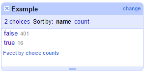
Facet by blank
Simple facet, which only scans the cells and calls the ones that are empty, true and the rest false.
Tableau
Tableau is a great tool in the field of Business Intelligence. It provides a fast and efficient option for data visualization for the users of Marketing Miner.
More info on the tool and its download at:
http://www.tableau.com/
Import of the output into Tableau
After launching Tableau, a user creates a new project, where he imports Excel output from Marketing Miner. From there a user then drags the Excel list that he wants to, using Tableau, process.:
Data visualization
After getting to the worksheet, you can simply, by dragging the dimensions and metrics, create the data visualization.:
More info on data visualization options in Tableau can be found at:
http://www.tableau.com/learn/training